Look Inside

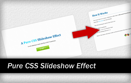
Having problem of creating presentation slideshow in web page? In this tutorial we’ll show you how to create a web presentation CSS slideshow effect, with the combination of CSS3 Transitions and CSS :checked pseudo-class with sibling selector (~).
[browser type=”cf-ox”]This working demo only works in browsers that support the respective CSS properties.[/browser]
The Idea
The main idea is to create a web presentation CSS slideshow effect like in Microsoft PowerPoint but using HTML and CSS only.
The HTML Markup
The markup will consist of several slides and radio buttons, each radio button will be attached to a slide. The purpose of using radio button is to get the selected slide when attached radio button is checked. Hence, we can simply use <label> tag with for attribute inside presentation slides to make the radio button checked when clicked.
<div id="slideshow">
	<!-- radio button for each slide -->
	<input id="s1-chk" class="s1-chk main-chk s-input" name="slide" type="radio" checked />
	<input id="s2-chk" class="s2-chk main-chk s-input" name="slide" type="radio" />
	<input id="s3-chk" class="s3-chk main-chk s-input" name="slide" type="radio" />
	<input id="s2-sub1-chk" class="s2-chk sub1-chk s-input" name="slide" type="radio" />
	<!----------------------------------->
	<!-- You can add more radio button -->
	<!----------------------------------->

	<!-- A slideshow canvas -->
	<div id="slidecanvas">
		<!-- Slide 1 -->
		<section id="s1" class="slide-holder">
			<div class="main-slide slide">
				<!-- Slide content goes here -->
				<label for="s2-chk">Go to slide 2</label>
			</div>
		</section>
		<!-- Slide 2 with sub-slide -->
		<section id="s2" class="slide-holder">
			<div class="main-slide slide">
				<!-- Slide content goes here -->
				<label for="s2-sub1-chk">Go to sub-slide</label>
				<label for="s3-chk">Go to slide 3</label>
			</div>
			<div class="sub-slide slide">
				<!-- Slide content goes here -->
			</div>
		</section>
		<!------------------------------------------->
		<!-- You can have more presentation slides -->
		<!------------------------------------------->
	</div>
</div>
There can be any number of presentation slides. Just to make sure that each slide have attached with a radio button.
The CSS
Note that we will exclude all vendor styles. Yet you can find them in the source files.
The #slidecanvas will hold all the presentation slides and where the animation takes place. Depending on how many main slides we have, set its width accordingly so that the slideshow able to present in full screen view.
#slidecanvas
{
	position: absolute;
	top: 0;
	left: 0;
	width: 400%;
	height: 100%;

	transition: all 2s cubic-bezier(0.785, 0.135, 0.150, 0.860);
	-moz-transition: all 2s cubic-bezier(0.785, 0.135, 0.150, 0.860);
	-webkit-transition: all 2s cubic-bezier(0.785, 0.135, 0.150, 0.860);
	-ms-transition: all 2s cubic-bezier(0.785, 0.135, 0.150, 0.860);
	-o-transition: all 2s cubic-bezier(0.785, 0.135, 0.150, 0.860);
}
The .slide-holder class will be used to segment out the main slides into different columns. Since we have four main slides in demo, set the width to 25% (100 / 4).
.slide-holder
{
	position: relative;
	float: left;
	width: 25%;
	height: 100%;
}
Also, we will style each slide using .slide class. In order to make the slide align in vertical center, we will use CSS calc function to calculate and set the height of slides according to user browser resolution.
.slide
{
	position: relative;
	background: url(slidebg.png) 0 0 repeat #fafafa;
	margin: 80px 120px;
	padding: 25px 50px;
	height: 600px;  /* fallback */
	height: -moz-calc(100% - 160px);
	height: -webkit-calc(100% - 160px);
	height: calc(100% - 160px);
	min-height: 600px;
	box-sizing: border-box;
	-moz-box-sizing: border-box;
	-webkit-box-sizing: border-box;
}
Now let’s animate the slideshow using radio button :checked pseudo-class with sibling selector. When selected radio button is checked, the #slidecanvas will move to the point we specified and at the same time create a slideshow effect.
input.s1-chk:checked ~ #slidecanvas
{
	left: 0;
}
input.s2-chk:checked ~ #slidecanvas
{
	left: -100%;
}
input.s3-chk:checked ~ #slidecanvas
{
	left: -200%;
}
input.main-chk:checked ~ #slidecanvas
{
	top: 0;
}
input.sub1-chk:checked ~ #slidecanvas
{
	top: -100%;
}
Last simply hide the radio buttons using CSS visibility properties since we want the presentation slideshow have its own flow.
.s-input
{
	position: relative;
	visibility: hidden;
}
That’s it! You can freely to style the content inside presentation slide just like normal using CSS. Hope you enjoyed this pure CSS Slideshow tutorial and find it inspiring!
You might be interested in our other CSS tutorials as well: =)
