Look Inside
The truth is, we can still creating those fancy headings, cool fonts and text effects without using Photoshop, but just with CSS. In this article, I have listed some useful CSS tricks and techniques which can be used to style your headings, fonts and text as well as content. Perhaps, these CSS tricks might inspire you on what can be done by using CSS rather than rely on Photoshop every time.
The best thing about CSS styling is it can greatly affects the performance of our website in terms of page load. Nevertheless, the only problem is browsers compatibility. Whatsoever, I still prefer using CSS to style headings, fonts and text in a matter of time. Somehow, there’s always having ‘fix’ for browsers compatibility in Internet. Cheer!!!
Text Spacing
I believe most of you are known about CSS line-height property. Though, I would like to recommend you one more CSS text spacing property, which is letter-spacing. It allows change of horizontal spacing between letters. With this, there is no issue in using ‘tight‘ looking fonts anymore.
h2 {
	letter-spacing: 1px;
}
Text Capitalization
Do you know that we can capitalize our text just with CSS? This is how it works!
h1 {
	text-transform: uppercase;
}
h2 {
	text-transform: capitalize;
}
h3 {
	text-transform: lowercase;
}
CSS3 Text Shadow
Obviously, CSS3 text-shadow property has the capability to create a shadow under text. It is widely used by web designers due to its simplicity and effectiveness.

h2 {
	text-shadow: 2px 2px 2px #CCCCCC;
}
Well, actually we can do even more with CSS3 text-shadow property rather than just to create a shadow under text. You’ll get to know from the CSS tricks below. So let’s keep reading!
CSS @font-face Trick
We all know that CSS3 has introduced a new @font-face rule. With this, we can get out of using only “web-safe” fonts. Anyhow, not all browsers (like IE) are support for new rule. A little trick for you – Use Font Squirrel @font-face generator. It just works even in IE!
Creating New Font Style with CSS
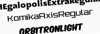
Yes, we can create our own font styles using CSS3 text-shadow. Here’s the trick of using CSS shadow! Be creative and create your…

.algerian {
	text-shadow: 1px 1px 0 #FFFFFF, 2px 2px 0 #000000;
}
.castellar {
	color: #FFFFFF;
	text-shadow: -1px 0 0 #000000, 1px 1px 0 #000000,
		     2px -1px 0 #000000, 3px 0 0 #000000;
}
.outline {
	color: #FFFFFF;
	text-shadow: 1px 1px 0 #000000, -1px 1px 0 #000000,
		     1px -1px 0 #000000, -1px -1px 0 #000000;
}
Inset Effect
Adding inset effect to your text and content can be easily done by CSS3 text-shadow. To have better result on headings, you should add more ‘shadow‘ to it.

.inset h2 {
	color: #444444;
	text-shadow: -1px -1px 1px #000, 1px 1px 1px #ccc;
}
.inset p {
	background: #CCCCCC;
	text-shadow: 0 1px 0 #FFFFFF;
}
Embossed Effect
The trick for creating an embossed text effect is pretty similar to inset effect. You just have to reverse the shadow color and change the font to semi-transparent.

.emboss {
	color: #ECECF6;
	text-shadow: -1px -1px 1px #FFFFFF, 1px 1px 1px #000000;
}
.emboss h2 {
	opacity: 0.5;
}
Shadow Blurring
We can make the shadows blurred by increasing the value of blur distance attribute (third attribute of text-shadow). Of course, this CSS trick will make use of these blurred shadows and creating cool growing effects.

.neon {
	color: #D0F8FF;
	text-shadow: 0 0 5px #A5F1FF, 0 0 10px #A5F1FF,
		     0 0 20px #A5F1FF, 0 0 30px #A5F1FF,
		     0 0 40px #A5F1FF;
}
Multiple Shadow-Layers Trick
If we set the value of blur distance attribute to 0, it will create a clone of text. No doubt, we can place the clone in different position. So, try to make use of these clones and produce something more attractive like 3D effect.

.threed {
	color: #CCCCCC;
	text-shadow: 0 1px 0 #999999, 0 2px 0 #888888,
		     0 3px 0 #777777, 0 4px 0 #666666,
		     0 5px 0 #555555, 0 6px 0 #444444,
		     0 7px 0 #333333, 0 8px 7px rgba(0, 0, 0, 0.4),
		     0 9px 10px rgba(0, 0, 0, 0.2);
}
CSS3 Masking
Here’s the trick of using CSS3 masking property on text.

.masking h2{
	color: #FFFFFF;
	-webkit-mask-box-image: url(mask.png) 0 0 repeat;
}
-webkit-mask-box-image will create a masking over the targeted element. Unfortunately, CSS3 masking will only works in webkit browsers. Other browsers are not supported yet.
CSS3 Gradient Tricks
Do you know that we can actually create a gradient text in our webpage without using any images, but just with CSS3 gradient plus CSS3 masking? Here’s the CSS trick for you!

.gradient {
	position: relative;
}
.gradient:after {
	content: 'Gradient Text';
	color:#000;
	position: absolute;
	top: 0;
	left: 0;
	z-index: -1;
}
.gradient h2 {
	color: #117FB2;
	-webkit-mask-box-image: -webkit-gradient(linear,
				left top, left bottom,
				color-stop(20%,rgba(0,0,0,1)),
				color-stop(100%,rgba(0,0,0,0)));
}
“Click” Effect CSS Tricks
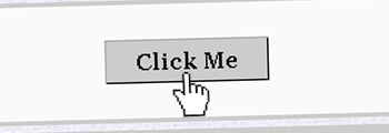
This CSS trick allows you to simulate a click effect for your links. Evidently, you may mimic on press effect like button for your links with this trick as well.
a.button {
	padding: 5px 20px;
	background: #CCCCCC;
	border: 1px solid;
	border-color: #AAAAAA #000000 #000000 #AAAAAA;
	text-decoration: none;
	font-weight: bold;
	color: #000000;
}
a:active {
	position: relative;
	top: 1px;
}
a.button:active {
	position: relative;
	top: 1px;
	left: 1px;
	border-color: #000000 #AAAAAA #AAAAAA #000000;
}
Multi-column Layout with CSS
Looking to get your paragraphs into nice and organized columns layout? You don’t have to purposely split your content into two or more and put them inside different table/layout. Yet, you could do it just with this CSS trick!

#column p {
	-moz-column-count: 2;
	-webkit-column-count: 2;
	column-count: 2;
	-moz-column-gap: 50px;
	-webkit-column-gap: 50px;
	column-gap: 50px;
	text-align:justify;
}
CSS Pseudo-Classes for Paragraph
Some designers like to use drop caps in content. To achieve this, you can create a special CSS class and wrap the first letter with this class. However, I’m going to show you an alternative for this using CSS Pseudo-classes only.

.content p:first-child {
	font-style: italic;
	color: #333333;
}
.content p:first-child:first-letter {
	font-size: 250%;
	margin: 10px 7px 0;
	float: left;
}
Text Selection CSS Trick
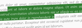
Last but not least, a CSS trick to overriding the default text selection color.
.content p.green::selection{
	background: green;
	color: #FFFFFF;
}
.content p.green::-moz-selection{  /* Firefox */
	background: green;
	color: #FFFFFF;
}
.content p.red::selection{
	background: red;
}
.content p.red::-moz-selection{
	background: red;
}
.content p.blue::selection{
	background: blue;
	color: #FFF296;
}
.content p.blue::-moz-selection{
	background: blue;
	color: #FFF296;
}
What Else?
Anyhow, if you have other CSS tricks about this, feel free to share with us! Share is caring…
