Look Inside

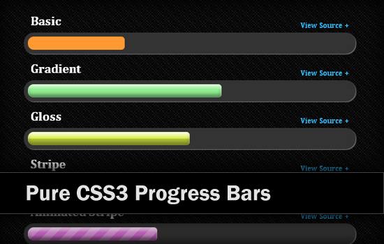
Howdy! Recently I discovered a very cool and interesting CSS3 tutorial about creating pure CSS3 progress bars from Chris Coyier page. Hence today I decided to try it with my own skill and share it with you all. Check out the outcome from Demo page.
The main techniques involved in this CSS3 progress bars tutorial are CSS3 background gradient effects combined with CSS3 animation property, that’s all! No images are needed. Check the browsers compatible picture below for best results.
[browser type=”cfs-x”]This working demo only works in browsers that support the respective CSS3 properties.[/browser]
The HTML Markup
The basic HTML markup for each progress bar is pretty simple. A
<div class="bar">
	<span></span>
</div>
To create extra effects on progress bar, I have added different CSS classes on each progress bar, for instance, gradient class will create gradient effect and stripe class will generate stripe pattern on progress bar.
In following tutorial I will talk about the CSS properties of these classes.
The Base CSS
It’s hard for me to explain all the classes used in demo page one by one right here. So I decide to discuss some of them only since most of them are pretty straight forward or similar. Of course you can still find them all inside source files.
Well, let’s keep going with the base CSS. It will contains 2 parts, a container with bar class and its child element, .
.bar {
	margin: 5px 0 3px;
	border: 6px solid #333;
	background: #333;
	overflow: hidden;

	border-radius: 50px;
	-moz-border-radius: 50px;
	-webkit-border-radius: 50px;
	box-shadow: 1px 1px 1px #777;
	-moz-box-shadow: 1px 1px 1px #777;
	-webkit-box-shadow: 1px 1px 1px #777;
}
.bar > span {
	display: block;
	height: 20px;
	width: 20%;

	border-radius: 5px;
	-moz-border-radius: 5px;
	-webkit-border-radius: 5px;
}
Some of these properties like width and height can be adjusted to suit your layout.
Gradient Effect
I use CSS3 box-shadow property to create the gradient effect for progress bar rather than using CSS3 gradient background. I preserve gradient background for other styling as it can do MORE than just a gradient effect.
.gradient > span {
	box-shadow:
		0 5px 5px rgba(255,255,255,0.6) inset,
		0 -5px 7px rgba(0, 0, 0, 0.4) inset;
	-moz-box-shadow:
		0 5px 5px rgba(255,255,255,0.6) inset,
		0 -5px 7px rgba(0, 0, 0, 0.4) inset;
	-webkit-box-shadow:
		0 5px 5px rgba(255,255,255,0.6) inset,
		0 -5px 7px rgba(0, 0, 0, 0.4) inset;
	filter: progid:DXImageTransform.Microsoft.gradient(
		startColorstr='#33ffffff',
		endColorstr='#33000000',
		GradientType=0 );
}
Since IE8 and below doesn’t support complicated CSS3 gradient background, thus I apply filter property on this class as well as a fallback. At least our progress bar won’t be displaced as plain color in IE. =)
Gloss Effect
Gloss effect can be generated by using CSS background gradient property as below. This will create a semitransparency gloss effect on top of progress bar, which mean it can integrate into any color of progress bar.
.gloss > span {
	background-image: -moz-linear-gradient(top,
		rgba(255,255,255,0.2) 0%,
		rgba(255,255,255,0.1) 45%,
		rgba(0,0,0,0.2) 55%,
		rgba(0,0,0,0.1) 100%);
	background-image: -webkit-gradient(linear, left top, left bottom,
		color-stop(0%,rgba(255,255,255,0.2)),
		color-stop(45%,rgba(255,255,255,0.1)),
		color-stop(55%,rgba(0,0,0,0.2)),
		color-stop(100%,rgba(0,0,0,0.1)));
	background-image: -webkit-linear-gradient(top,
		rgba(255,255,255,0.5) 0%,
		rgba(255,255,255,0.1) 45%,
		rgba(0,0,0,0.2) 55%,
		rgba(0,0,0,0.1) 100%);
	background-image: -o-linear-gradient(top,
		rgba(255,255,255,0.2) 0%,
		rgba(255,255,255,0.1) 45%,
		rgba(0,0,0,0.2) 55%,
		rgba(0,0,0,0.1) 100%);
	background-image: -ms-linear-gradient(top,
		rgba(255,255,255,0.2) 0%,
		rgba(255,255,255,0.1) 45%,
		rgba(0,0,0,0.2) 55%,
		rgba(0,0,0,0.1) 100%);
	background-image: linear-gradient(to bottom,
		rgba(255,255,255,0.2) 0%,
		rgba(255,255,255,0.1) 45%,
		rgba(0,0,0,0.2) 55%,
		rgba(0,0,0,0.1) 100%);
}
Stripe Effect
Same goes to stripe effect. We can generate stripe pattern through CSS3 gradient background property, and same as gloss effect, I will create a partial transparency stripe pattern so that it can apply to any color of progress bar.
.stripe > span {
	background-size: 30px 30px;

	background-image: -moz-linear-gradient(-45deg,
		rgba(255,255,255,0.15) 0%,
		rgba(255,255,255,0.15) 25%,
		rgba(255,255,255,0) 25%,
		rgba(255,255,255,0) 50%,
		rgba(255,255,255,0.15) 50%,
		rgba(255,255,255,0.15) 75%,
		rgba(255,255,255,0) 75%,
		rgba(255,255,255,0) 100%);
	background-image: -webkit-gradient(linear, left top, right bottom,
		color-stop(0%,rgba(255,255,255,0.2)),
		color-stop(25%,rgba(255,255,255,0.2)),
		color-stop(25%,rgba(255,255,255,0)),
		color-stop(50%,rgba(255,255,255,0)),
		color-stop(50%,rgba(255,255,255,0.2)),
		color-stop(75%,rgba(255,255,255,0.2)),
		color-stop(75%,rgba(255,255,255,0)),
		color-stop(100%,rgba(255,255,255,0)));
	background-image: -webkit-linear-gradient(-45deg,
		rgba(255,255,255,0.3) 0%,
		rgba(255,255,255,0.3) 25%,
		rgba(255,255,255,0) 25%,
		rgba(255,255,255,0) 50%,
		rgba(255,255,255,0.3) 50%,
		rgba(255,255,255,0.3) 75%,
		rgba(255,255,255,0) 75%,
		rgba(255,255,255,0) 100%);
	background-image: -o-linear-gradient(-45deg,
		rgba(255,255,255,0.15) 0%,
		rgba(255,255,255,0.15) 25%,
		rgba(255,255,255,0) 25%,
		rgba(255,255,255,0) 50%,
		rgba(255,255,255,0.15) 50%,
		rgba(255,255,255,0.15) 75%,
		rgba(255,255,255,0) 75%,
		rgba(255,255,255,0) 100%);
	background-image: -ms-linear-gradient(-45deg,
		rgba(255,255,255,0.15) 0%,
		rgba(255,255,255,0.15) 25%,
		rgba(255,255,255,0) 25%,
		rgba(255,255,255,0) 50%,
		rgba(255,255,255,0.15) 50%,
		rgba(255,255,255,0.15) 75%,
		rgba(255,255,255,0) 75%,
		rgba(255,255,255,0) 100%);
	background-image: linear-gradient(135deg,
		rgba(255,255,255,0.15) 0%,
		rgba(255,255,255,0.15) 25%,
		rgba(255,255,255,0) 25%,
		rgba(255,255,255,0) 50%,
		rgba(255,255,255,0.15) 50%,
		rgba(255,255,255,0.15) 75%,
		rgba(255,255,255,0) 75%,
		rgba(255,255,255,0) 100%);
}
Not only these, we can generate even more effect through gradient background as you can see in demo page.
Animation
It is easy to have an animated progress bar with help from CSS3 animation property. Change the values of animation and keyframes as you like and attach the animate class to any <span> to make the progress bar animated.
.animate {
	animation: progress 2s linear infinite;
	-moz-animation: progress 2s linear infinite;
	-webkit-animation: progress 2s linear infinite;
	-ms-animation: progress 2s linear infinite;
	-o-animation: progress 2s linear infinite;
}

@-webkit-keyframes progress {
  from {
    background-position: 0 0;
  }
  to {
    background-position: -60px -60px;
  }
}
@-moz-keyframes progress {
  from {
    background-position: 0 0;
  }
  to {
    background-position: -60px -60px;
  }
}
@-ms-keyframes progress {
  from {
    background-position: 0 0;
  }
  to {
    background-position: -60px -60px;
  }
}
@-o-keyframes progress {
  from {
    background-position: 0 0;
  }
  to {
    background-position: -60px -60px;
  }
}
@keyframes progress {
  from {
    background-position: 0 0;
  }
  to {
    background-position: -60px -60px;
  }
}
